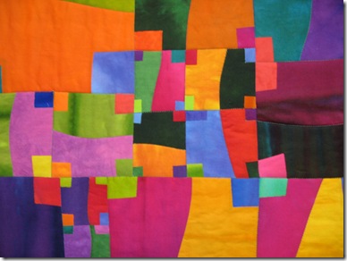
Split Crosses
Hand dyed cotton, fused, machine quilted. 67.5x46” September 2005
I found this lost post about this particular quilt and it says it all:
I began thinking about my next quilt. Yesterday I had a long email conversation with my friend Tommy about her work in a series. She sent me a jpeg of her wonderful new piece and it stymies me how one can make so many wonderful pieces from one single idea. She and I discussed my miserable failures previous series of Crosses and how disappointed and discouraged I felt about them. She noted that there was certainly nothing wrong with the concept I was using, but that the fabric choices were obviously the problem. True true true. I was substituting my fabu colors for those that I imagined to be artier and more ‘sophisticated’. Black and more black and then black mixed into the dyes to make them darker, hence more ‘mature’.
Dave thinks those quilts are scary, and he starts humming the Phantom of the Opera whenever they are discussed.
So Tommy said this:
What I don't like AT ALL is your color and because of the texture of the color, it's creepy in 29 crosses and Black Cross. I think you should go on and on with that series but use different color; use Melody color. I personally like Split Crosses alot, which I told you on a couple occasions but you just banged it down. I know that we all have our own taste, but there is a universal liking in the colors you choose, when you are not trying to reinvent yourself. Go with what feels right to you. Don't try to do something that you aren't.
Now that is a good thing for me to hear. Or read I mean. So I determined that I would revisit this series and use my fave colors and try to see if it would work.


Maybe this is a key ingredient I've been missing in my own work: recognizing what is "me" and using that.
ReplyDeleteHmmm. I thought that, but didn't really transfer my thoughts to words. Tommy is right. Your colors are YOU! I recall once reading in your blog that you preferred not to use black, so I was surprised when I saw it in the Crosses series. It doesn't hurt to experiment with a different look and feel, but if the feel isn't comfortable, it's ok to ditch it! Experimenting is what it's all about, isn't it?
ReplyDeleteSo....... we are back on with quilting? This is good news!
ReplyDeleteDave, too funny - Phantom of the Opera... some of my most favorite music!!!
I simply love this Crosses quilt and believe Tommy was accurate in her assessment. Yes, using "Melody color" is what works and what we've come to associate with the distinctive look in your quilts. While I understand the need to grow and explore new avenues, it sometimes comes back to the old saying, "if it ain't broke, don't fix it."
ReplyDeleteI may be the lone voice of approval for those darker somber colors but that's just me. The idea of Dave humming the phantom just tickles my funny bone! =)
ReplyDeleteBlack Cross and 29 Crosses were more vampirish to me. But split crosses is a great composition, and of course the colors are pure Melody! Glad to hear you're thinking about going back to work in this series. -Connie in Alabama
ReplyDeleteNot to confuse you all, but that last sentence was copied from the 2005 post. I am NOT returning to this series.
ReplyDeleteI said so at the time and then never did. And that remains true today.
Dave totally cracks me up!
ReplyDeleteWhile I didn't dislike these darker pieces they seemed almost angry. Was it during a dark period in your life?
Can't wait to see what comes of the new space and your decision for the future artwork.
Always fascinating!
I suppose I don't understand why you got such negative feedback about the darker pieces. When I saw 'Black Cross' last week I literally gasped. It was such a different direction from your other work and that was what made it so interesting to me. I enjoy your brighter work very much but the darker cross works seemed to reveal something else about who you are that I had never seen before and it was fascinating to see that part of you manifested in your work.
ReplyDeleteI am a new reader of your blog and have been totally impressed. Your Split Crosses is quite lovely and bright and colorful and eye-catching.
ReplyDeleteAfter the comment about your husband humming the Phantom of the Opera whenever the series is discussed, I had to see the others. 29 Crosses and the Black Cross are absolutely breathtaking! There is a watercolor feel to them. I don't think I have the words to describe how striking they are -- and also a little other-worldly.
Whether they please you are not, they are something new and different that you tried and they are "real." There's nothing wrong with trying another "zone." I generally like bright colors, but during times of struggle and heartbreak I notice that I am drawn more to darker, more dramatic colors -- especially red and black! :P
You are an artist. Whatever you do will be the right thing to do!
Kim