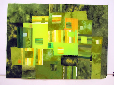
Shared Spaces
50.5x37" unquilted hand dyed cottons, fused
After fooling around in the garden all week, studiously avoiding even entering the studio, I was forced by the weather and guilt to get back to work inside. The piece I had started some time ago (when was this?) was still waiting patiently for me to get it on the wall and decide what had to be done.


Here it is in the "way before" stage. O so wimpy. Nothing there to interest me. I took a picture or two and fooled around on the computer, cropping and switching postions and finally threw in the towel and began a major deconstruction.


These parts seemed to have something but lacked focus and drama. More removing of wimpiness and then filling in the emptiness with stronger more definite shapes and values. Finally I got to this arrangement and took a picture and in the computer I could see an area (white dashes )that needed tweaking and so I changed that and was satisfied.

What a good feeling to de-wimpify this composition.
 UPDATE: On the one skein of red yellow and blue sock yarn...Deb from Ontario Canada found a skein for me of exactly the right yarn!! I knew the blog would work this out for me. Thanks Deb. It is found here http://www.yarnela.com/page/page/864430.htm


This is gorgeous! But then, the "way before" stage was also very promising. I kinda liked the "wimpy" colours, which provided interest and contrast in a different way.
ReplyDeletewonderful colour world I like it very much green .I paint textile but until all of them green and yellow that if want if not but I paint always I like it the two colours combination
ReplyDeleteLooks amazing......but I didn't see any wispiness at any stage of the game.
ReplyDeleteOf course I meant wimpiness !!!
ReplyDeleteYour finished version is beautiful!" I liked the colours in the 'wimpy' version, but agree with you, they did nothing to amplify the finished piece.
ReplyDeleteIt's beautiful! I created a green collage recently for a pillow but haven't finished it yet as it's hard to get past all that work for a pillow.
ReplyDeletehttp://juliebagamary.blogspot.com/2011/01/sofa-pillow-idea.html
I don't miss the pink! Love the outside edges...
ReplyDeleteI agree with Ursula (sorry :)) but I don't care for the dark green background. Too matchy, matchy. Not enough contrast with the other greens to make it "pop". I think the "wimpy" version just needed a different color other than green to make it work (one of your pinks, maybe??). Just MHO
ReplyDeleteRegarding the sock yarn. Isn't it wonderful the things we can give/receive from the internet experience? Mass exposure for sure!
ReplyDeleteOMG! I love green and this is orgasmic. Love it just the way it is now!
ReplyDeleteIt´s great! I like your colours and I think, the background helps to brighten the greens und jellow much more.
ReplyDeleteCongratulation!
Susi
You're right, it came out just the way it should. I originally liked the pinks, but they just didn't play as well. I think the greens went from a soft green to a deeper shade.
ReplyDeleteWell, I love the dark green background... I think it makes the whole quilt pop. But, then I like everything you do! :)
ReplyDeleteI just love it when you go to the studio! The dark values really make the inside glow!
ReplyDeleteWow - really beautiful and eye-popping!
ReplyDeleteNice to know I'm not the only one struggling with composition lately. I like how you resolved it!
ReplyDeleteLUV IT. I like the depth of contrast, the limited color palette and the looseness of the design. It really sings!
ReplyDelete