 Royal Blues
Hand dyed cottons, fused, hand and machine quilted. 19.25" x 8.5"
 Composing in this banner shape is not as easy as working in a square format. I am not as confident going in and the resulting layout is kind of tentative. I did cut a bunch of batting in this size and plan on learning to work with this form.
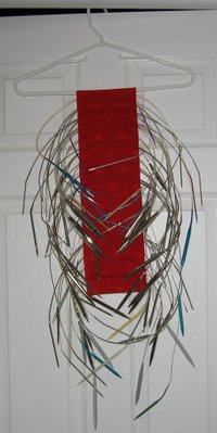
I am also knitting like mad, and since I was gifted with all that yarn and needles, I am reevaluating what I will keep and what I will pass on. For example: I have collected many circular needles over the years and finally decided to organize them.
My instant holder is made from a length of fabric, folded over a hanger and stitched in channels to hold the needles.
The act of putting them in the holder made me count how many duplicates I have. I am giving those away to my pal Anne Lullie. She is also getting my excess double points, many of which were gifts from three other people. Share the wealth!


I like the banner shape. Kind of a diptych effect. I don't know what would happen in person, but on the screen I am looking at each half separately, and then at the whole. I think the yellow dots are making that happen, and it is a very interesting composition. Much more complicated than the small squares.
ReplyDeleteLove that hand-stitching!
I am feeling the same way about it like Judy does. The yellow dots are drawing the eyes to the center, then I am seeing either the left or right side. I imagine the dots are meant to be where the eyes should rest, but the yellow is perhaps too compelling. I wonder what the effect would be had the dots been placed closer to lower left or right.
ReplyDeleteI have to say though that this Royal Blues made me sit up straight in my chair!!! Stunning.
Honestly without the yellow dots it was a major snore!
ReplyDeleteGreat idea for the circular needles. I am intrigued that you find the rectangle (banner) more difficult than the square. I'm thinking that it is what I most often choose. Maybe I should try some squares!
ReplyDeleteIt is a very good thing that I don't have to "choose", cuz there is nothin' better than the next one you show us! I really do love this series and am fascinated with the size you are working in, the rectangle is great. Did you approach it as two halfs or one whole, cuz I think it ROCKS. I like the calm place and the yellow dots add such vibrance and make it sing.
ReplyDeletePlease, Ms., might I have some more?
How clever a storage system is that? WooHoo!
ReplyDeleteMaybe it's the dynamics of the horizontal format that bothers you.
Hi Mel, I love your latest series! I was looking at this one and although I like the shape, the whole right side needs to be lopped off. It doesn't seem to relate to the rest of it. Anyway, who am I? I love your work, thank for sharing.
ReplyDeleteLove the format, love the dots. Love the squares marching left to right across the middle. The only thing that bothers my eye is the stripes on the right. My eye leaves the "canvas" there and doesn't come back. But then again, not every piece needs to have an art school composition; irregularity gives the mind something to work on. Colors in this one are excellent.
ReplyDeleteThere was something more free about your paintings that I was really liking. I liked the addition of the white lines in the paintings especially. Wonder how you could bring that into the quilting?