Two New Stacks
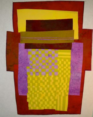
Stack #6 28x33"
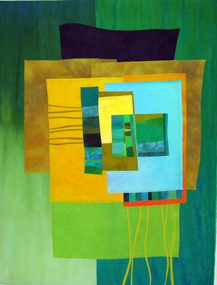
Stack #7 30x39"
The color schemes of these last two pieces used be so unusual for me, but they are starting to become more familiar and less strange. I know I was influenced by the colors of Tommy's house, in both of these.
And I have been recently influenced, colorwise, by Frieda too, using her famous love of a sort of limey-olive green.
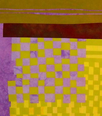
In these two pieces I went for lower contrast too. The lilac/gold checkerboard section in #6 uses opposites on the color wheel in values that are almost the same. This is new for me. The gold/yellow section is so close in value, that it behaves almost as a solid. The thinking is that it acts as a big swath of one color rather than two. I am going for spare, as if you couldn't tell.
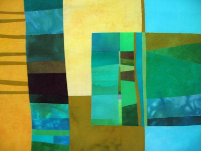
In #7, I unearthed a large panel of fused green scraps, and cut away the one part I liked the best, and used that for the 'starring role' of this piece. Since it was cool, I went for warm next and then back to cool. On my way to Tommy's house I saw a billboard advertising a new housing development and the logo was this:
 I liked the small square with the vertical stripes and decided that had to be included. It's a little less treelike in the quilt.
Quiltwise, I am happier than I have been in ages, making quilts like these. Getting a taste of something new in each work, and using up my stash like it should be used. In big chunks. I might have to dye something just for me soon.
But first...I gotta paint.



Thanks again for sharing
ReplyDeleteI love all your work
Catherine Scotland
I really like the new direction, Melody. And the color combinations struck me immediately!
ReplyDeleteWOW! #7 is awesome!
ReplyDeleteOh, I just love that top piece. An unusual color combo that is edgy and wonderful.
ReplyDeleteLove the contrast between the golds and bluey greens in #7... gorgeous!!
ReplyDeleteI love them! Sometimes we have to mix it up for ourselves to make life fresh, you know?
ReplyDelete