I saw this artist's work for the first time today on Gerrie Congdon's blog.
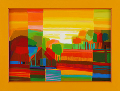
The artist is Ton Schulten and I went to his site and was absolutely entralled. Color and shape and line and oooooo!
I felt that he could teach me something about my own work. Notice how eleglant and simplified his landscapes are. NO fiddly stuff, just hints of forms that we all recognize. I decided to try and make something of my own that fulfilled the desire I had to have all his paintings for myself.

So I shot this still life. I have been wanting to play with pears in my work, since I love their shape and color. The other fruit was so nice, I decided to add them too.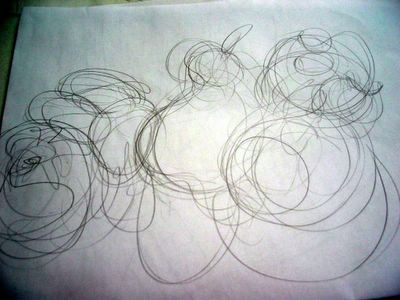
My warm up sketch began with loose swirling lines, for placement and to get the feeling of the shapes. I did about three of these and chose the best one to clarify.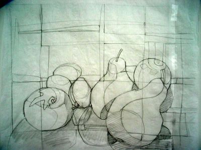
Nice, huh? I should have stopped there.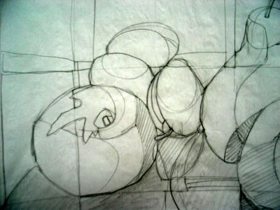
But I got all interested in the shadows and the lines crossing and the tiny bits of shapes that would eventually have to be sliced and diced to form the fruits and shadows.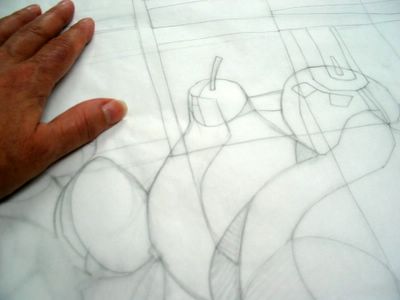
So to re-clarify, a sheet of tracing paper went over that drawing and I attempted to eliminate all my 'darlings'.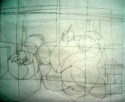
There! I left in the shapes of the shadows, because I was still hung up on this being an abstraction of reality. In my little mind these fruit shapes had to have dimension, hence shadows.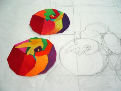
I made one apple and hated it. Then I made another and hated it.
I needed to look at the paintings again, since I clearly was lost and needed direction. I printed out several of Ton's paintings and realized that every section of his grid was its own composition. The house, trees, or boats in his paintings were merely flat areas of color. NON-Dimensional.
I took my drawing and just cut off one side of it and worked it for color and line, letting the pear and apple shape be suggestions rather than literal representations. The background is the best, because of the LIMITED colorway. O my. I have taught myself something. Alrighty.
This was a good exercise and I think I can do this for real when I have the time to be calm and patient. The piece above is only about 12"x 5". I like it just the way it is.
When I do the real quilt, it will be very simple, even less division of space in the layout. Bigger blocks of color...REALLY.



Very beautiful! Thank you for sharing! I really love the swirly line drawing. I wonder if you could accomplish something that swirly with thread play type techiniques? I really appreciate the time you must spend to keep this blog current - its always interesting.
ReplyDeleteI agree. Schulten's work took my breath away. I almost ordered one of his date books, but was too lazy to figure out the exchange between pounds and dollars. That Gerrie -- she has good taste. And speaking of taste... that sliver of pear and apple is delicious!
ReplyDeleteooo... this style so compliments your fabrics and your own style. And the last piece of work? Fabulous.
ReplyDeleteI love the limited palette of the background... and the fact that the fruit are indicated merely by the curving shapes.
Very nice result, and I appreciate the discussion about how you worked through it. Jen
ReplyDeleteHe is certainly a soulmate of yours in regards to color! I am fascinated with his grid system and the "stripes" of changing intensity across his paintings. Very inspiring.
ReplyDeleteAWESOME!! Again, thank you ever so much for sharing your work in progress ideas and photos - it means a lot to me, being able to see how one of my heroes works (*blushes*) - and provides me with a good butt kicking - I'm off to sewwwwwwwwww!
ReplyDeleteYour colours are, as always, FANTABULOUS, btw!
I saw that post and was blown away too! Thank goodness you started on a piece inspired by his work. I can't wait to see what you come up with!
ReplyDeleteWhat a great exercise, and how kind of you to share your process with us! (I love when you do that!) Looks like fun ideas to play with. Also, I'm inspired by your using another artist's style to make you reconsider your own. Very thought-provoking.
ReplyDeleteWow! Look what I inspired. Now if I can only do that, too. Can I work on something like this in your class?
ReplyDeleteGreat!!!
ReplyDeleteI love when the inspiration hits like this. Since you shared your try-out and playing... it made me again see that the work also is a lot about "to play" just to learn more about me and how I want my the texstiles to look so I like them :-)
Well, Ms. MFA...you have demonstrated your mastery of the close personal space cropping introduced to us by the advent of industrial revolution and the camera and japanese prints and blahblahblah. Excellentamento! Your colors are fabulicious.
ReplyDeleteThanks for sharing your process Mrs. Mel! I love seeing how other artists work through their pieces.
ReplyDeleteIt’s actually a great and helpful piece of information. I
ReplyDeleteam happy that you shared this helpful information with us.
Please stay us informed like this. Thanks for sharing.
My web site - 강남오피
(jk)