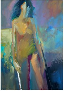
18x24" acrylic on watercolor paper
I can't seem to leave out enough and couldn't resist getting a few facial features in there. In my opinion this is too laboured.
I like the cropped version better and the colors are fine but comparing it to the loose quality of the Skip Lawrence painting below, you will see where I was aiming and how far afield I got.
 This painting I would hang in my living room but mine is too explicit and looks more 'naked' than his. arrgghh.
 This painting I would hang in my living room but mine is too explicit and looks more 'naked' than his. arrgghh.
 I am not happy like I was. However I am not giving up. Working larger made it easier to get those details in, so I may go back to large brush/small paper and force the issue. Stay tuned.


I love your paintings! The colors are fantastic & there's just enough details to pull the viewer in but it's also loose enough that it allows the viewer to bring their own feelings & emotions to it.
ReplyDeleteMelody, paint with your non-dominant hand. Then you will set yourself up to have a little less control and it will be looser. When you think that you are working tight and predictable, you must change your normal set up in order to break out of habits. It really does work. Everything looks good, though. The color is fantastic. Sonji
ReplyDelete