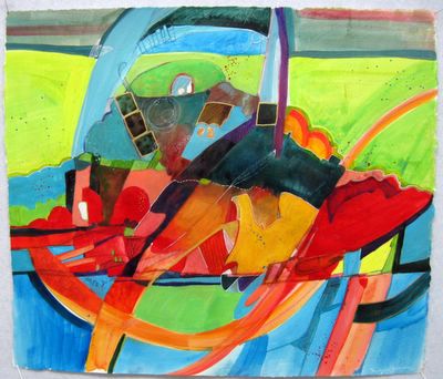
The Bridge
The Bridge
Acrylic, colored pencil, ink on gessoed paper
I used a white gel pen, and Pigmas in black and blue and Prismacolors on the painted surface.
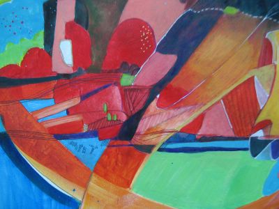
I needed to draw into the surface to delineate the details.

I needed to draw into the surface to delineate the details.
Red is so transparent, no matter which paint I use.
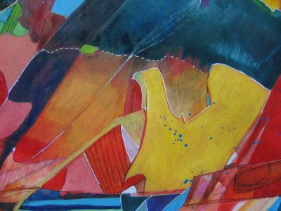
Funny that I rarely allow white in my quilts, yet I really love it in the paintings.

Funny that I rarely allow white in my quilts, yet I really love it in the paintings.
I began this with a wild pencil scribble and then squirted some paint on the plastic table covering and with a spritz of water, spread the several colors around with a brush to loosen up the paint. Then I turned the drawing side down onto the paint and did a monoprint.
Before it fully dried, I went and got a haircut. This isn't necessarily an art technique, but it did make me give the painting some time to rest before I attacked it today.
I felt a lot freer with this work, since the paper had been despumating in my garage since 2002. It was torn from a 30x40 sheet, and is not watercolor paper. It is for printmaking and super absorbent, which is why I coated it first with gesso. I will continue to work with paper for a while as I feel I can learn more without the angst of the more expensive stretched canvas.
There are several empty drawers now in my studio which can hold my collected trials. And if any of them should turn out good, then I vow, I will matt and frame them with the aid of one of the many 50% off coupons from Joann's or Hobby Lobby.
When I painted in my youth, I worried about whether there was a chance I could ever become a great painter. It was such an enormous goal that it overwhelmed me. And if I couldn't be great, the next step would be second rate, followed by mediocre. Such thinking is part of what made me quit painting. All that garbage in the brain.
I don't entertain thoughts like this now. I care only that I can satisfy myself with my results on a day to day basis. I hope to improve and gain confidence. That's a goal I can handle.


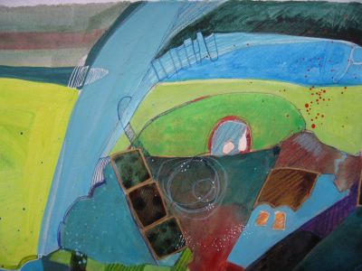


Where have I been, I've missed several days of blogging! And I just love depth perception, altho I like the original orientation better than the sideways one.
ReplyDeleteCan paper despumate? I didn't know.
You seem to have broken through the barrier! Go, go, Mel!
It looks like you are having fun doing these! How wonderful they are. I like the original orientation of the previous painting as well. But like any thing its all in whos looking at it. I am enjoying watching what you do with this path your on. So much fun~~!
ReplyDeleteAh, yes. There are advantages to be gained for "hanging in there" for soooo long. We may loose the physical attributes of youth, but gain self-knowledge and the confidence to implement it. You GO girl!
ReplyDeleteYou are already a much better painter than I will ever be! I like your use of color. Tonight there was a program on Minerva Tichler. It was interesting to see how an artist develops. She did some of her most well-known and best work in her 60s, even though she started as a young girl.
ReplyDeleteQuote: *Funny that I rarely allow white in my quilts, yet I really love it in the paintings.*Unquote.
ReplyDeleteFunny you should say that because that is exactly what I was recently thinking about your works.
Interesting works too.
What fun you seem to be having on this journey! Love both pieces.
ReplyDeleteA thought on the red paint. You are using Galeria which is a student brand. Not a bad paint, but less pigment than you'll find in Golden or W&N Finity. Most reds are fairly transparent, but you could try a Liquitex cadmium red which isn't bad. It has a better amount of pigment in the paint. I use the two ource jars. I also use the same brand of Napthol crimson (cheaper than cadmium) which is my favorite not-so-orange red and although it says it's transparent I find it's pretty comperable in coverage to the cadmium red which calls itself opaque.
ReplyDelete