
Craft Alliance Logo
I found this logo in an ad in my current issue of American Style. It caught my eye, as black and white line drawings often do and I thought this would make an excellent quilt layout. Simple and elegant which is my current quest. I made it into a quilt in no time, using the yummy pastels that I had recently fallen in love with. In a discussion with my darling Dave I told him that I had in mind a small series of works that would allow me to experiment with different and unusual for me color schemes.
The series would be hung in a line in my imaginary solo show and be examples for my classes to illustrate the effects of divergent color schemes. When I showed him the pastel (first attempt and still unfinished) he remarked that it was not my best work and certainly not groundbreaking or all that original. Ignoring the insult, I remarked that that was not the point. (I should know better than to show unfinished work to him, as he will never be able to imagine it as it will be. ) And then we veered off into a discussion of what direction my work would be going in the future and shouldn't I be working on that instead of fooling around with different color schemes???
The series would be hung in a line in my imaginary solo show and be examples for my classes to illustrate the effects of divergent color schemes. When I showed him the pastel (first attempt and still unfinished) he remarked that it was not my best work and certainly not groundbreaking or all that original. Ignoring the insult, I remarked that that was not the point. (I should know better than to show unfinished work to him, as he will never be able to imagine it as it will be. ) And then we veered off into a discussion of what direction my work would be going in the future and shouldn't I be working on that instead of fooling around with different color schemes???
I found this conversation a trifle frustrating and made up my mind that I would get this color scheme thing out of my system and simultaneously show him that this layout was a good one and would look very kool with different motifs in the one panel and lots of nice quilting in another.
So temporarily forsaking finishing of #1, I went right down to the studio and started on #2. I intended to use delicious fabrics and so I fused up several newer pieces of silk charmeuse and shantung and used an old design, from the Croton quilt as my motif du jour. The original Croton quilt is huge, like 77" wide but having seen it reduced considerably in my mind's eye, I knew it could work in this new venture.
 click
click
#2 which at the moment is nameless. It measures 22"x34" and is mostly silks but some cottons and cotton sateens.
 click
click
The Croton leaves are cut and fused to a leaf shape and then the background is inserted between the leaves, in just little slivers of fabric, which is finally fused directly to batting.

The aforementioned 'fancy quilting' which is leaf shapes to echo the motif band.
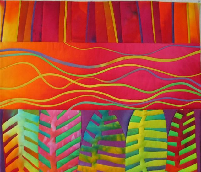
The real ripoff from the logo is the wavy lines. I love the fact that these are straight-cut fused cotton and just ironed into curvy lines.
I am pleased with the way this turned out and will return to finish #1, which will require some hand quilting, as that will support the nature of that design better. It doesn't have a spot for fancy quilting as does #2.
On another note:
Since I was committed to watching the Oscars broadcast, which is notoriously long, I decided that this was the time to bring back into focus the last pair of unfinished airport socks, started last year on my way to teach at Art Quilt Tahoe. I began the second sock at 5:30pm and got as far as the main foot part (past the heel) when I became too sleepy to finish the rest. I did get them finished last night while watching my addiction, American Idol. These are self striping Regia and I made no attempt to match the stripes, which imho, make them art socks. Just in time to wear for St. Patrick's Day.
If you, dear Reader, are an American Idol addict, please let me know, at melody @ mcihispeed. net. and we can dish the contestants together.

Oscar Socks


When I see green socks named Oscar, I think of the guy that lives in a trash can on Sesame Street. Ah, the frame of reference of a mother of young children. Adore the quilts and am also completely amazed at the miracle of turning a straight piece of fabric into a curve with careful ironing. Brilliant!
ReplyDeleteOOOOh, Yes! I haven't watched every one, but so far I love the guy with the hat, and I want to marry Bo Bice. I just love to say the name. BoBice. BoBice. BoBice. Not so sure about the women as I have only watched them one time, but will report back tomorrow.
ReplyDeleteWell Melody! After reading this entry the first time, I thumbed through a magazine looking at logos for design ideas...didn't find one that I wanted to work with, but I can see more clearly now (that the rain is gone, its gonna be a bright, bright sunshiny day). I have some sketches that I did last year based on African architecture that I might see if I can find and do something with. Thanks!
ReplyDeleteLove the croton leaves quilt! I don't watch American Idol, but just now catching up on Project Runway since I didn't watch it at the time, but my husband in his usual foresight Tivo-ed it for me.
ReplyDeleteThis comment has been removed by a blog administrator.
ReplyDeleteThis comment has been removed by a blog administrator.
ReplyDeleteMelody ...........
ReplyDeleteWonderful taste I have done something to the same effect in my sketch book. Your choice of colours are simply divine... and the stylising is fabulous ... keep up the great work.
dangling by a thread
Sandy
This comment has been removed by a blog administrator.
ReplyDeleteWow - a fiber artist and knitter and Oscar watcher AND American Idol nut? Now I know why I linked to your blog! lol. We have a little friendly pool going at work - 50 cents a week to vote, one point for each right answer. I got the girls right the first week (was on a business trip and forgot to phone in my vote - ratz!) and this week got Celena, Joe, and David. This is definitely much better than last year, much more talent. Oh yes, and I love your work with color and shape - just beautiful!
ReplyDelete